August 16, 2020, 01:15 PM
ChuckFinleyThe myth and science behind your gauge cluster illumination color
This
article is from a couple years ago, but I was thinking about it. One thing I don't miss about my silverado was the blue illumination. Never understood why it would be blue and the same Sierra would be red illumination.
Alex Kierstein
Feb 28th 2017 at 3:01PM
As I was driving the hunch-rumped, growly BMW X4 M40i recently, I was thinking about a long-standing but low-intensity domestic disagreement in my house. I drive an older Toyota pickup with soft green gauge illumination, and I'll jockey my dimmer so it's barely bright enough to see clearly when I glance down. She drives a Mazda, and sets it to a moderate level (but brighter than I like it) so she can see in all conditions, including at dusk.
I can't fault that; it's sensible. After all, messing with the dimmer is just another type of distraction. I was thinking about this because I had just driven her car, and left the dash lights too low. Whoops.
As I cursed my absent-mindedness, the X4's automatic headlights kicked on and the gauges switched from primarily white illumination to the classic BMW orange-red color. I like this: the white is crisp and clear during the day, and at night the orange-red looks purposeful – like the inside of a submarine conning tower or a spy plane. But why white, and why orange-red? I'll admit I subscribed to some amateur theories about night vision. I thought red light was the best color to preserve night vision – hence the submarine association – felt blue was the worst, and had a profound ambivalence about green. But I'd never really fact-checked my assumptions.
BMW X4 M40i
After some mostly unhelpful internet research, I reached out to BMW and was put in touch with President of BMW Designworks Oliver Heilmer. Designworks is a design shop wholly owned by BMW in LA, and it was intimately involved with the entire process that resulted in BMW's X family of SUVs. So it's appropriate that I'm speaking to Heilmer about the X4's dashboard.
Heilmer told me that BMW's characteristic orange-red hue is generated by light at a wavelength of 605 nanometers. The color was chosen to allow the driver to clearly see the instrument cluster, but also to be able to adjust to the darkness outside the vehicle quickly after looking up. The eye doesn't tire as quickly trying to read gauges illuminated with red-orange light, he said. BMW discovered this in the 1970s, and it's been both an aesthetic trademark and a conscious ergonomic decision ever since.
Heilmer didn't get into it, but the research I came across about how the human eye processes light lends a lot of credence to 605 nanometers being the ideal wavelength for night driving. Remember in anatomy class, when you leaned about rods and cones in your eyes? You might not remember much beyond that – I certainly didn't – but rods are very sensitive and essential in low-light situations. They're much more numerous, and more concentrated in the periphery of your eyes, not in the center. They also don't really process color, which is why it's tough to discern hues or sharp details in dim light, but they're great for detecting motion. Imagine our prehistoric predecessors checking out a cave in the dark: Rods are there to help you figure out if there's a bear in the back of that cave, and if it's coming to eat you, but not what color it is.
And then there are cones. Basically, cones do details and color very well. They're concentrated in the center of your eye. Most of them are tuned to detect red light, so you need less light overall to see something illuminated in that color. The other piece of the puzzle is that those motion-sensing rods are particularly insensitive to red light.
So imagine red light from a gauge cluster hitting your eyeball. The rods, very sensitive to light in general but not so much to red, aren't dazzled by it. The cones, less sensitive to light overall but highly attuned to red light, are able to pick out the details of what's illuminated pretty well. When you look up from the instrument cluster, your rods are in good shape and able to scan the road ahead for bears while your cones chill and wait for the next glance at the gauges.
BMW X4 M40i
But as I noticed in the X4, BMW has been playing with white gauge illumination for a while now. As Heilmer explained to me, that's because during the day the key consideration is maximum contrast. White is easy to see in bright light, and the clarity is excellent. Hence the X4 switchover at night.
Heilmer explains that the new 5 and 7 Series cars use an intelligent system keyed to a windshield-mounted light sensor for more control of the light color and intensity presented to the driver. BMW has also conducted further research that's found less difference between white and orange-red light at night than previously thought, so these newer cars will maintain neutral white dial illumination even at night (at somewhat reduced intensity), with orange-red displayed less prominently. With fully programable and digital instruments, Heilmer says, "from BMW's point of view the ideal adjustment is always displayed accordingly."
toyota tacoma
So what's up with the green color in my older Toyota pickup (pictured above)? I asked a company representative, and a group of Toyota design and engineering staff collaborated to answer my questions. The answers were delightfully different from BMW's, perhaps reflecting different cultural sensibilities.
Toyota gave me three reasons for choosing green. The first is that the green color evokes a neutral emotional impression – it's a cool color, which distinguishes it from "warning" colors like red or yellow idiot lights. I find it fascinating that Toyota gave thought to how the color made drivers feel, rather than merely the physical effects of the light. Secondly, it provides good color contrast with other gauge illumination hues, like blue high-beam indicators. Lastly, it's the most "efficient" color – my word, not theirs. Basically, at a given amount of light, humans perceive green to be the brightest and easiest to see, the explanation goes.
But just like BMW, Toyota has moved to white gauge illumination. In the past, it was difficult to keep the white hue consistent as you made it brighter. But with modern dash illumination technologies, this limitation has been overcome. Like green, white is emotionally neutral, easily distinguishable from other gauge hues, and is perceived as being almost as bright and clear at a given level of light as green. Plus, it's easier to read at higher brightness levels than green, and provides better contrast in the dark. Interestingly, the company also used to use blue in some of its products, but since blue light has to be turned up brighter to provide the same functionality in a gauge cluster, it's been abandoned in favor of white.
The secondary color Toyota uses is an amber with a bit of red in it, making it more conspicuous to the driver and also (presumably) providing many of the same benefits that led BMW to the hue. The company mainly uses it in its enthusiast-oriented offerings to convey "a sporty feel," but the trade-off is there's a potential for emotional response and also possible confusion with warning lights.
These represent just two automakers' perspectives on gauge illumination hue, but they're revealing of the choices automakers make in general – there's more to the colors chosen than simply aesthetics. That being said, many car owners want to override the choices the designers made. For those with older cars and a DIY mentality, there's a healthy trade in little bulb condoms that change the color of your gauge lights. For many newer cars, you can swap out the LED bulbs, but you may have to be handy with a soldering iron. If you drive a late-model Ford Mustang, you don't have to do any of that, thanks to a nifty feature called MyColor, which allows the user to change the gauge hue (and ambient lighting) to their heart's content.
As digital gauge panels take over from traditional dial clusters, drivers will probably have a greater degree of control over the color (and configuration) they see. Just take a little advice and be thoughtful about your partner's preferences – and remember to turn the dimmer back to where they had it.
August 16, 2020, 03:00 PM
flashguyIIRC, the overall sensitivity of the human eye peaks around Citron (greenish-yellow). Many fire departtments have painted their trucks that color because it is easier to see in low light than red. (Red is the first color to vanish as the light dims.)
How all that relates to which colors are chosen for dashboard illumination is open to interpretation, and various authorities differ.
Ignoring lamp colors in darkness is not a good idea. I once worked with some radar display consoles that had controls in deep blue and deep red near each other. The operators constantly complained of headaches. It developed that the eye cannot focus simultaneously on those 2 colors and so focus was constantly shifting back and forth between them. When the blue was changed to green and the red to orange, much of the focus disparity was eliminated and the headaches went away.
flashguy
August 16, 2020, 03:46 PM
SigJacketI’ll admit, I like the Ford green dashes, such as my old Ranger. And I like them solely because the soft green glow reminds me of the green dashboards when I was a kid, riding at night from somewhere with my parents.
Which weren’t really all green. Mostly a white light and a radio dial with lots of green in it. Nostalgia isn’t particularly picky.
August 16, 2020, 03:46 PM
joel9507From the days trying to use a telescope in the backyard it was very clear that using red lights when puttering around near the scope preserves your night vision better than white or green.
Red's a good choice, if you want to be able to see your dash...and then be able to see the road afterward.
August 16, 2020, 10:12 PM
x0225095The British used the advantages of red illumination in WWII while their aircrews were waiting for a mission. A British scientist (psychologist I believe) found that if aircrews relaxed, waited, played cards, read, wrote letters, etc in their ready stations while under red illumination they would have better night vision and a quicker dark adaptation than if they waited under white illumination.
August 17, 2020, 12:32 AM
AglifterBMWs are much more pleasant, than any other car I’ve driven, on long night drives through the desert, so long as you remember to block the high beam indicator.
My Porsche 968 wasn’t bad, either.
August 17, 2020, 08:51 AM
Dusty78quote:
Originally posted by bobtheelf:
quote:
Originally posted by Dusty78:
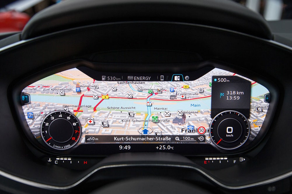
This is kind of a moot point. In 3-4 years 90% of new cars will have LCD screens instead of traditional gauge clusters. Heads up displays are also becoming more and more standard.
Not exactly. They still need to choose the colors for those LCD displays.
What I mean is that a lot of the digital dash’s I have seen have a wide array of colors and are very configurable. With navigation on you might have 20 different colors at any given time. Also with a digital dash since the entire panel is illuminated there isn’t a harsh or blinding color that stands out, it’s a milder transition.
August 18, 2020, 10:32 AM
joel9507^^^^^
Yowch! Could that be more distracting?
No way would I want that up when I was driving, particularly at night.
quote:
Originally posted by Dusty78:
since the entire panel is illuminated there isn’t a harsh or blinding color that stands out, it’s a milder transition.
Right up till you look outside at night.
