Go  | New  | Find  | Notify  | Tools  | Reply  |  |
Equal Opportunity Mocker |
Reading this and my mind immediately slips into the "this is Peggy" commercial characters voice. Weird how my mind works... ________________________________________________ "You cannot legislate the poor into freedom by legislating the wealthy out of freedom. What one person receives without working for, another person must work for without receiving." -Dr. Adrian Rogers | |||
|
Info Guru |
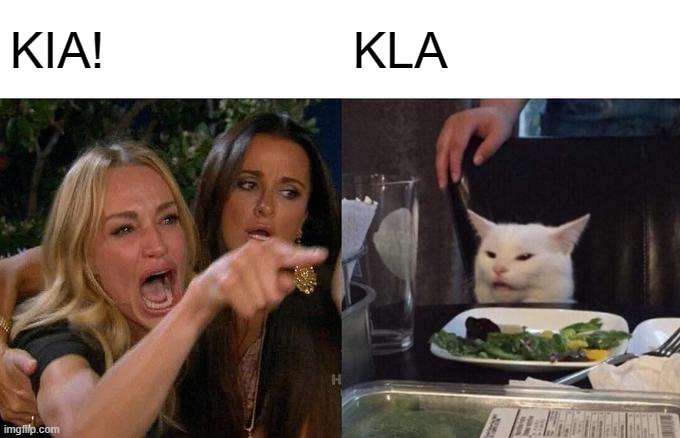
I think the slash would have been better as well...  “Facts are stubborn things; and whatever may be our wishes, our inclinations, or the dictates of our passions, they cannot alter the state of facts and evidence.” - John Adams | |||
|
| Thank you Very little  |
So will positive things.... | |||
|
Member |
You mean KDM, right? I'm not a huge fan of the KDM K logo, it looks like a weird Lexus logo at the right angles, but the Stinger script looks great. The Enemy's gate is down. | |||
|
"Member" |
That's not the Nill grips logo? _____________________________________________________ Sliced bread, the greatest thing since the 1911. | |||
|
| Member |
A lot of Kia vehicles over here don't have the standard logo like in the US anyway. The new one to me looks a bit more like Korean Hangul, not sure if that was intended or not. 10 years to retirement! Just waiting! | |||
|
| Low Profile Member |
staring at it will induce a seizure | |||
|
His Royal Hiney |
I share your wonderment but, in addition, if I was an employee, my thought would be: "and how much money did they spend for somebody to come up with this new logo???" "It did not really matter what we expected from life, but rather what life expected from us. We needed to stop asking about the meaning of life, and instead to think of ourselves as those who were being questioned by life – daily and hourly. Our answer must consist not in talk and meditation, but in right action and in right conduct. Life ultimately means taking the responsibility to find the right answer to its problems and to fulfill the tasks which it constantly sets for each individual." Viktor Frankl, Man's Search for Meaning, 1946. | |||
|
| His diet consists of black coffee, and sarcasm.  |
 | |||
|
Member |
Saw one the other day and it took a moment to figure it out. Harshest Dream, Reality | |||
|
Member |
Our Hospital system here got bought out by Prisma and they changed all the signs and every time I see one I think some executive's 11 year old daughter designed the logo.... and why would a system that is providing health care and promoting healing people have a logo with broken letters in it?  My Native American Name: "Runs with Scissors" | |||
|
| On the wrong side of the Mobius strip  |
This is likely how the new logo came about.  | |||
|
Member |
I dig the new logo. Every time I see a Telluride with the old logos, they make me cringe. | |||
|
| That rug really tied the room together. |
Lame unreadable text. Most Americans wont even know what the hell they are looking at. Not good. ______________________________________________________ Often times a very small man can cast a very large shadow | |||
|
Member |
Where is it written that brands must use text for their cars? **Laughs in BMW roundel** | |||
|
Alienator |
They have always had some of the worst styling in the world. Hate the tiger nose. SIG556 Classic P220 Carry SAS Gen 2 SAO SP2022 9mm German Triple Serial P938 SAS P365 FDE P322 FDE Psalm 118:24 "This is the day which the Lord hath made; we will rejoice and be glad in it" | |||
|
Member |
That's highly subjective. The Kia Stinger is a better looking BMW Gran Coupe than a BMW Gran Coupe (saying this as someone who owned a 440XI Gran Coupe). | |||
|
| Political Cynic |
its horrid, and if thats the best they can do with a logo, I wonder what the best they can do with a car... definitely not inspiring | |||
|
Member |
At first glance, I didn't like the new logo at all, but after looking at it a few times, it still looks like KIA to me. KIA makes decent cars. I don't know why they need to change the logo. I really don't think it'll sell more cars. 十人十色 | |||
|
| Partial dichotomy |
| |||
|
| Powered by Social Strata | Page 1 2 3 4 |
| Please Wait. Your request is being processed... |
|
© SIGforum 2025
